Using motion charts to fix campaign tracking in Google Analytics
UncategorizedThere are a few reasons why clicks and visits from Adwords campaigns will likely never be same in your Google Analytics reports (or indeed any other web analytics tool), but you should of course make sure that you have a correct implementation as Adwords is a paid campaign…
But how can you tell if everything has been implemented correctly? If you have lots of Adwords campaigns driving traffic to lots of landing pages any errors might be hard to spot.
First of all, I would expect there to be fewer clicks than visits. If a visitor clicks multiple times on an Adwords ad during the same session you would see multiple clicks but only one visit in Google Analytics. Also, clicks are counted even before the visitor lands on your site, so if the tracking code does not execute in time on the landing page before the visitor navigates away you’d also lose visits.
In any case, even if there is a normal discrepancy you’d expect that discrepancy to be consistent. So if your normal percentage of visits to clicks is 90%, a percentage of 20% in one of your campaigns would not be normal.
 You could of course look at the numbers directly in the reports table and look for unusually large differences between visits and clicks, but if you have lots of data to look at you might not spot any unusual patterns.
That’s why I like two visual approaches.
1) Using Compare Two Metrics
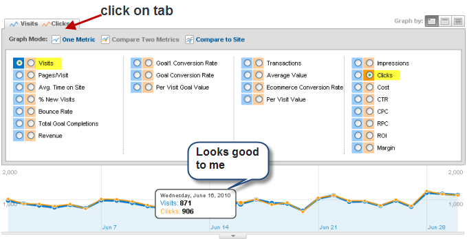
Pull up a new Adwords campaign report and click on the tab above the graph and select Compare Two Metrics. Choose Visits and Clicks. Data look OK to you and are clicks and visits in line?
You can then repeat this approach to drill down into Campaigns and Keywords. Unfortunately you’ll have to select those two metrics again every time you pull up a new report.
But fortunately, there is a sexier way…
2) Using Motion Charts #
Pull up your Campaign or Keyword report and click on **Visualize **in the top half of the screen.
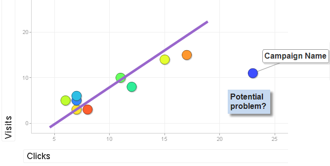
Motion charts allow you to see how several dimensions move over time in a graphical way. Visits should already be selected on the Y-axis. Select **Clicks **for the X-axis. Now you can see how visits and clicks behave over time. As I said earlier, you should expect clicks and visits to be correlated, but the motion chart should allow you to spot any outliers pretty easily.
As with all web analytics, you are looking back in time, but this is a pretty cool and powerful way to spot any errors.

