Looker Studio Radar Chart Community Visualization
If you've ever needed to compare multiple entities across several dimensions, a radar chart (also called a spider chart or web chart) is an excellent visualization choice. I recently built a radar chart community visualization for Looker Studio that makes it easy to integrate these powerful charts into your dashboards.
What's a Radar Chart? #
Radar charts display multivariate data as a two-dimensional chart with three or more quantitative variables represented on axes starting from the same point. They're perfect for:
- Comparing products across multiple features (like our phone comparison example)
- Visualizing performance metrics across different categories
- Showing strengths and weaknesses of different options at a glance
Features #
The Looker Studio Radar Chart comes with several powerful features:
- Interactive elements: Hover over data points to see exact values
- Responsive design: Automatically resizes to fit your dashboard
- Multiple series: Compare multiple items in a single chart
- Customizable styling: Adjust fonts, colors, and more
- Percentage or raw value display: Works with any data scale
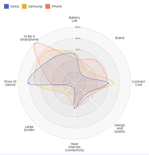
Here's a look at the chart in action:
How to Set It Up #
Adding the radar chart to your Looker Studio reports is straightforward:
- In your Looker Studio report, click on "Community Visualizations" > "Explore More" > "Build your own visualization"
- Enter the path to the visualization:
gs://analytics_buddy_viz/radar-chart - Format your data with:
- A dimension for each item name (e.g., "Phone Model 1")
- Metrics for each axis of comparison (e.g., "Battery", "Camera", "Speed")
Data Format Tips #
For best results, your data should be structured with:
- A column for item names
- Additional columns for each metric/axis
- Values normalized between 0-1 for percentage display or any range for raw values
For example:
name,Battery,Camera,Speed,RAM,Storage
Phone Model 1,0.8,0.7,0.6,0.9,0.5
Phone Model 2,0.6,0.9,0.7,0.8,0.4
Under the Hood #
This visualization is built with modern web technologies:
- Observable Plot for the visualization engine
- ESM modules for clean code organization
- Vite for fast development and optimized bundling
The radar chart is implemented using Plot.js and D3's geo projections, with an azimuthal equidistant projection to create the circular pattern.
Try It Today #
Ready to add radar charts to your Looker Studio reports? Check out the working demo to see it in action!