Tracking mobile sites and redirects in web analytics
Optimization and TestingWeb AnalyticsWith the increasing number of mobile devices coming to your website you might be considering creating a mobile version of your website. And naturally, you’d like to be able to track everything properly in your web analytics.
Here is how it typically works. When a visitor arrives on your main site you have some kind of mechanism to detect the type of browser. If it’s a traditional browser then you’d show the normal www.yoursite.com version of your site. If it’s a mobile browser you’d redirect traffic to a subdomain such as m.yoursite.com, which is optimized for mobile traffic.
But therein lies the rub. If the browser detection and redirect is done in Javascript, you may lose the initial referrer information. So instead of a nice keyword from Google, your web analytics will show a direct visit or referral from your main domain. This is the same issue with AB testing on a landing page.
If the browser detection and redirect is done server-side, you’re good to go.
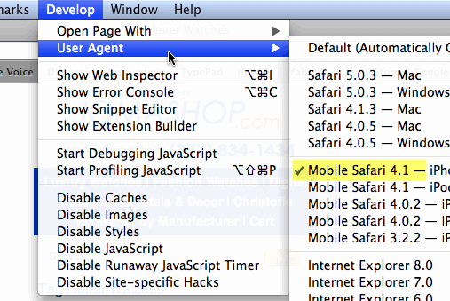
Want to see this for yourself? If you have a mobile site you can test this yourself by using Safari and turning on the Develop menu, where you can set the user-agent to a mobile version. You are basically impersonating yourself as a mobile user.
Now go to google.com, which should show you the mobile version.
Next, do a search for your site and click on the result. You should see the mobile version of your site (if you have one).
Finally, type in javascript:alert(document.referrer) into the browser bar and press Enter. This will report the referrer.
If you see “http://www.google.com/” Good
If you see “http://www.yoursite.com” Check your web analytics

